McClusky Nature Photography Blogs
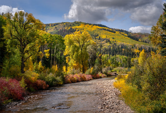
Image of the Week: Fall River in the San Juan Mountains
This is the story behind my fine art landscape images: Fall River in the San Juan Mountains I and II. I love the mixture of red, yellow, and green foliage; the river leading the eye to the mountain meadow and aspen groves; and the interesting clouds in the sky.
Image of the Week: Fall River in the San Juan Mountains
This is the story behind my fine art landscape images: Fall River in the San Juan Mountains I and II. I love the mixture of red, yellow, and green foliage; the...
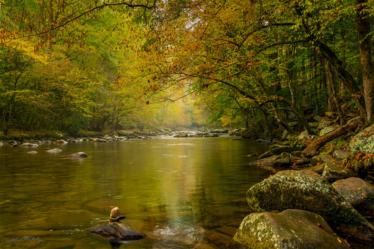
Runner Up: Fall River
Welcome to my next edition of "Runner Up!" Given the two images here, "Fall River" and another taken the same day at the same river, I strongly believe the top image is the better (of course all art is in the mind of the viewer, so you may feel differently!) In the top image, I love how the eye is drawn to the distant trees and water by the reflection in the river, and how the distance has a partially foggy, misty feel softening the mood of the image. The trees on the river sides and leaning over the river frame the primary focus of the photo, as do the rocks in and around the river. There is secondary interest amid the rocks and trees, but they do not overwhelm the primary focus. The lower image is a runner up, despite the arguably more interesting foreground. I do like the water rushing over the rocks, and there are interesting rocks and tree trunks along the river. But rather than the soft, colorful trees in the distance, they are in full sun and thus harshly lighted as well as being less colorful. There is no leading line to the distant trees: the river is blocked by a line of dark boulders, and the lighter toned path along the river's edge is so busy it stops the eye's flow. Further, the forested top half has bright trees behind shaded trees, again adding distracting contrast and making it look messy. Perhaps this image would have been better had I been able to look more down the river and if the sun were partially hidden by clouds. This bottom image is a good example of the challenges created by taking a 3-dimensional scene and forcing it into a 2-D image. While looking with my eyes, the forest showed interesting layers of the nearby shadowed trees blending to distant highlighted trees. But in a 2-D photograph that depth is lost, making the trees a jumble that takes work to sort out. A good trick to use while photographing is to look at the scene with one eye, removing the third dimension from your perception. You will, alas, frequently find that intriguing layered scenes become a complex mess in 2D. Thanks for reading!
Runner Up: Fall River
Welcome to my next edition of "Runner Up!" Given the two images here, "Fall River" and another taken the same day at the same river, I strongly believe the top...
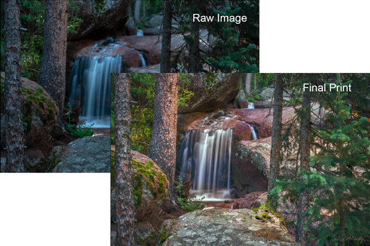
Raw Photo to Fine Art: Horsethief Falls II
Of course not all images take as much work to edit as some I've shared recently. For instance, this image was pretty simple. The raw image above is the unedited image straight from the camera without auto-processing. Two things jump out. First was that not everything was in focus, even with a rather small aperture, given the huge depth of field in this image. So I focus stacked: I combined 7 photos, focused incrementally from the front to the back, choosing the sharpest portion of each image. The second problem was how blue the photos were. It really _was_ that blue, being primarily lit by the very blue sky. But our eyes compensate for the color of the light, so in a small print it looks wrong. I warmed up the image ... but not all the way so I could keep contrast I remembered: the warm dappled light and cold blue shadows. After adding some global tonal corrections to help mute the bright patches of sun, I was at the image above, "global edits only" image. But the highlights - and especially the water - was still too blue, and the patches of sun were still too bright. So in the local edits I warmed just the brightest tones, and also darkened the sunny patches. After a few other tweaks, it was done: The final nature print! The last image below is the camera's auto-edit. In addition to the areas out of focus, the waterfall is a teal color, and the surrounding areas are too bright, taking focus away from the falls and secondarily the dappled light. Thanks for reading!
Raw Photo to Fine Art: Horsethief Falls II
Of course not all images take as much work to edit as some I've shared recently. For instance, this image was pretty simple. The raw image above is the unedited...
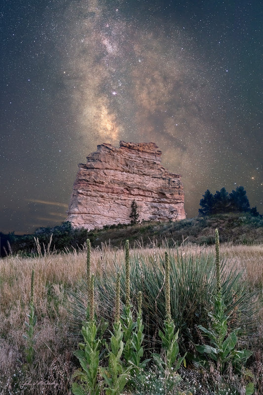
Image of the Week: Milky Way over Monument Rock
There are quite a few of these rocky outcrops along Colorado's front range, Garden of the Gods being the most famous (for example this and this). They're the last testament to long millennia of nature wearing down the sedimentary rock uplifted with the Rockies - and how much harder the granite of the Front Range is!I've wanted to take this landscape photograph as long as we've lived here, but didn't think I'd be able to pull off. The big problem is light pollution: to get the Milky Way I'd have to point to the south towards Colorado Springs and its 500,000 inhabitants. Happily, I finally got smart!First, this composition is pointed Southwest, thereby putting the worst light pollution to the left side. I had to sacrifice some of the Milky Way core, but some is better than none! Second, I waited for a particularly clear night, thereby further reducing the scattered city light. Even so I had to use several gradients to minimize the city's glow ... and combine nearly 100 photos to get low enough noise to support a large 30-40 inch print.I particularly like this composition: there's a real sense of depth from the foreground with the yucca and mullein pointing up to the rock, to the rock itself followed by the distant Milky Way. Thanks for reading!
Image of the Week: Milky Way over Monument Rock
There are quite a few of these rocky outcrops along Colorado's front range, Garden of the Gods being the most famous (for example this and this). They're the last testament...
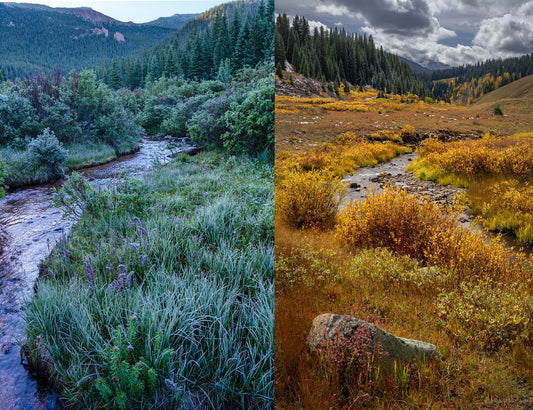
Runner Up
I learn a lot by comparing my top and runner-up images, trying to figure out why one works and another doesn't make the mark. I consider the above image on the right a definite runner up. Nice idea, but it just didn't pan out. The foreground drew me to this composition: the beautiful frost, the purple flowers amidst the grasses, and the creek leading the eye into the distance. It was a beautiful spot! But the composition is too monochrome, the flowers don’t stand out from the grasses, and you really can't tell all is covered with frost crystals until you zoom way into the image. Also, there is no nice "payoff" when you follow the creek into the image, just layers of trees. For a real "payoff", the granite outcrops are too small, the sky is boring, and the splash of dawn sunlight on the mountains is insignificant. I also don't like the way the creek is half cut off in the lower left. I still think this was the best compromise image, but this time (as is usually the case) I couldn’t make pieces fall in place. For instance I tried getting much closer to the flowers, but then the creek was hidden by the grasses. When I moved deeper into the creek to include more of the creek, the flowers and grass were too small and no longer the focus. I _should_ have make the shot only about the flowers in the frosty grass, and completely ignored the creek and mountains. I think I did a better job with the next image. This one is also about the foreground with creek leading to the distant mountains as supporting actors. But here there is more interesting variety throughout. There's still a lot of yellow and orange, but it's not nearly as monochromatic as the left image. I like the way the shape of the rock fits in the space made by the creek-side brush, and now the creek comes more naturally from the side of the image, still leading into the distance. The top is a decent payoff: the evergreens stand out from the golden meadow, and the sky has interesting clouds. As I've mentioned, in art there are no right and wrong answers. Do you see things differently?
Runner Up
I learn a lot by comparing my top and runner-up images, trying to figure out why one works and another doesn't make the mark. I consider the above image on...
Raw photo to Fine art: Mountain River at Dusk II
How did I get to the final fine art print of my image Mountain River at Dusk II? In this blog I show waypoints along the way, starting from a sample raw image, and the impact of global and local edits. I finish with the final image an a comparison to the computer generated auto-edit. I think these two final images show why I take the time and effort to edit my landscape photographs myself!
Raw photo to Fine art: Mountain River at Dusk II
How did I get to the final fine art print of my image Mountain River at Dusk II? In this blog I show waypoints along the way, starting from a...